How to Choose the Right Colors for Your Brand (And Why It Matters)
Colors Influence Emotions and Brand Perception
When you think of major brands like Coca-Cola, McDonald’s, or Tiffany & Co., their signature colors immediately come to mind. That’s because color plays a powerful role in shaping how we perceive a brand.
The colors you choose for your business aren’t just about aesthetics—they influence emotions, customer behavior, and brand recognition. The right colors can make your brand feel trustworthy, exciting, or luxurious, while the wrong colors can send the wrong message or fail to connect with your audience.
So how do you choose the perfect colors for your brand? Let’s break it down.
The Psychology of Colors – What Different Colors Communicate
Colors evoke emotions and subconscious reactions, which is why choosing the right ones for your brand is crucial. Here’s what different colors typically communicate:
🎨 Red – Passion, energy, urgency (think Coca-Cola, Target, YouTube)
🎨 Blue – Trust, professionalism, stability (think Facebook, PayPal, IBM)
🎨 Yellow – Optimism, warmth, friendliness (think McDonald’s, Ikea, Snapchat)
🎨 Green – Growth, health, sustainability (think Whole Foods, Starbucks, Spotify)
🎨 Purple – Luxury, creativity, wisdom (think Cadbury, Hallmark, Yahoo)
🎨 Black – Sophistication, power, elegance (think Chanel, Nike, Apple)
🎨 White – Simplicity, cleanliness, modernity (think Apple, Tesla, Adidas)
Tip: Consider how you want customers to feel when they see your brand and choose colors that align with that emotion.Aligning Colors with Your Brand Personality
Your brand’s personality is how you present yourself to the world—your voice, values, and the experience you create for customers. Your color palette should reinforce that identity.
Ask yourself:
✅ Is my brand bold and energetic? Bright reds, oranges, and yellows may be a great fit.
✅ Is my brand professional and trustworthy? Blues and grays are often associated with reliability.
✅ Is my brand luxurious and high-end? Deep purples, golds, or blacks can communicate elegance.
✅ Is my brand natural and eco-friendly? Greens and earthy tones align with sustainability.
Tip: unsure about your brand’s personality? write down a few words that describe your business (e.g., “friendly,” “modern,” “bold”) & match colors that reflect those traits.Understanding Color Combinations – How to Create a Cohesive Palette
A strong brand identity isn’t just about picking one color—it’s about crafting a balanced color palette that works together. Here’s how:
🎨 Primary Color: The main color associated with your brand. This should be dominant in your logo and marketing materials.
🎨 Secondary Colors: Supporting colors that complement your primary color and add variety.
🎨 Neutral Colors: Background colors like white, black, gray, or beige that help keep your design balanced.
How to Choose a Palette That Works:
🔹 Monochromatic: Different shades of the same color for a clean and sophisticated look.
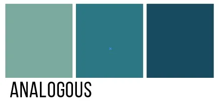
🔹 Analogous: Colors next to each other on the color wheel (e.g., blue + teal + green) for a harmonious feel.
🔹 Complementary: Opposite colors on the color wheel (e.g., blue + orange) for a bold and dynamic contrast.
Tip: Use online color palette tools like Coolors or Adobe Color to test different combinations before finalizing your choices.Applying Your Brand Colors Consistently
Once you’ve chosen your brand colors, consistency is key! Using your colors the same way across all platforms builds brand recognition and makes your business look polished and professional.
Here’s where to apply your brand colors:
✅ Logo – Your colors should be the foundation of your logo design.
✅ Website – Buttons, backgrounds, fonts, and accents should reflect your brand palette.
✅ Social Media – Stick to your brand colors in graphics, profile images, and templates.
✅ Marketing Materials – Flyers, business cards, and packaging should all align with your color scheme.
Tip: Create a brand style guide that includes your exact color codes (HEX, RGB, and CMYK) to keep consistency across all platforms.Tips for Testing Colors Before Finalizing Your Brand Identity
Before committing to your brand colors, test them out to see how they work in real-world applications.
✔️ Mock Up Your Website and Social Media – Try different color combinations to see how they look in action.
✔️ Print Test Your Branding Materials – Colors can look different on screen vs. in print, so make sure they translate well.
✔️ Gather Feedback – Ask a few trusted colleagues or potential customers how they perceive your brand colors.
Choosing the right colors for your brand is more than just a design decision—it’s a strategy that influences customer perception, emotions, and engagement. Take the time to choose colors that truly reflect your brand’s identity, and you’ll create a strong, lasting impression.
Need help crafting the perfect color palette for your brand? Let’s chat!


